More people now shop straight from their phones while walking the dog, from a laptop at home, or through a tablet during lunch. That means your online store needs to look right and work well no matter what screen someone is using. That's where thoughtful ecommerce website design really helps.
A store that works on every device does not happen by accident. It takes planning and smart choices to keep shoppers from getting frustrated. If they cannot tap the right button or finish checkout on their phone, chances are good they will leave. That is why we believe the best way forward is building something simple, clean, and helpful for anyone who visits, no matter what they are using. Let's go through a few solid steps that lead to an online store people can trust and use with ease.
Plan Before You Build
Before anything gets built or designed, we always start with a plan. It makes the rest of the process smoother and helps avoid wasted time or confusion.
Here is what a strong starting point can include:
- Make a list of what you are selling. Be specific. Having clear categories in mind helps keep the store simple to use.
- Think about how people will move through the store. Will they search? Click on categories? Scroll through featured items?
- Write down all the pieces you will need, like photos, item names, short descriptions, return info, and any rules for shipping.
The goal here is to picture the store like a map. If you were walking through it, would everything be in a good spot and make sense? Taking time to lay this out now saves trouble down the road when you are halfway through and realize something important is missing. When you work step by step, it also gets easier to fill in the blanks as you go. This way, each part of the site has a purpose, and you won't end up with pages that feel out of place or cluttered.
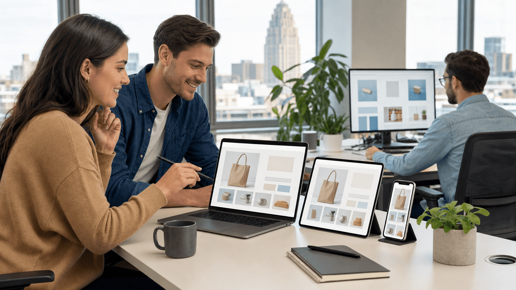
Choose a Layout That Fits All Screens
These days, not every screen looks the same, and your store has to keep up. That is where having a flexible layout comes in. Responsive website designs automatically adjust what people see so buttons do not fall off the edge, menus are not too tiny to tap, and pages do not stretch too wide on big screens.
We focus on a few main parts when setting up a design that works everywhere:
- Menus should shrink into a clean icon for phones but still stay open and clear on laptops.
- Checkout pages need big touchable buttons and few steps to keep people moving forward without frustration.
- Text should stay easy to read no matter the size of the screen.
A layout that adjusts to the device keeps everything in the right spot, helps speed up the shopping process, and avoids mistakes during checkout. Testing the layout is simple if you try out your store as a shopper would, moving from a computer to a phone or tablet. The goal is not to get fancy. It is to make sure nothing feels broken and everyone can make it through your store without guessing where to click next. The best layouts also help highlight your top products by placing them where they naturally catch attention, guiding shoppers toward the things you most want to show them.
Make Shopping Easy for Everyone
A good ecommerce store does not just look nice. It helps people move quickly, find what they need, and feel ready to buy.
Here are a few must-haves that keep things simple and friendly:
- Product pages should have big, clear pictures and short descriptions that answer common questions.
- One-click checkout makes paying faster and keeps people from giving up halfway through.
- Try using features like tap-to-call, messaging shortcuts, or store directions that link straight to a map when someone taps on them.
Fast pages matter too. If your site takes too long to load, a customer might head somewhere else before it even finishes opening. Speed becomes even more important for phones using slower data, especially outside where Wi-Fi might not be available. When someone visits your store, they are much more likely to make a purchase if they can find and buy what they want fast, without confusion. Pages that take a long time to load often frustrate shoppers, making them lose patience and look elsewhere.
To keep things simple, think about all the little choices that help a shopper. Clear "Add to Cart" buttons, easy-to-spot search bars, and helpful product filters can keep your store running smoothly. Short, direct descriptions of each item also let shoppers get the answers they need quickly. Adding shortcuts like "save for later" or letting people easily change quantities without starting over can take away the small annoyances that slow down a buyer's visit. Friendly error messages, like when a promo code does not work, also make a difference for keeping people happy.
Test and Adjust for Real Users
Once the store is designed and ready, the work is not fully done. Testing it out can help catch things you might not notice until someone uses it in real life.
Here is what we usually focus on:
- Open the store on different devices like a phone, tablet, laptop, and desktop to make sure everything looks right.
- Ask a few people you trust to try it out. Watch where they hesitate or get stuck.
- Keep track of any bugs or odd behavior, and fix them quickly. Even small issues can make someone give up on a purchase.
Technology keeps changing, and so do people's habits. Checking in every month or so allows small tweaks that keep your store running smoothly. Small updates are much easier when you've tested how real users move through your site. For example, you might find that most shoppers use the search bar on their phones, or that certain pages load slower than others. By listening to their feedback and watching how they interact, you can spot the little things that need fixing before they become bigger problems.
Testing is not just for the launch either. Each season brings its own changes as people's habits shift, like more browsing on tablets on rainy days or local shoppers using phones at outdoor events in Buffalo in May. Checking in after new features are added, or during busy seasons, helps you keep your store up to date and ready for every customer, no matter how they shop.
Local Focus Matters
For businesses around Buffalo, NY, local habits shape how shoppers browse. May is a time when many people are finally spending more time outside after a long winter. That means people might be checking websites from their car, while at the park, or between errands instead of sitting at home.
That is why mobile experience matters even more. It is important that your store works well not just on a desktop, but on the phone a customer pulls out during a spring street fair or quick coffee stop. Along with that, clear store hours, directions, and phone numbers should all be easy to find and ready to tap from a screen. These little touches go a long way, especially when someone is nearby and ready to take action.
Being aware of things like special events, festivals, or changes in local traffic can help you prepare ahead so your store's contact info, in-stock notices, and pickup details are always updated. People want quick answers when they are on the go, so creating direct links from your store to maps or messaging apps can help local shoppers act fast and feel taken care of. If your store does local delivery, use banners or clear labels to mention this, since it might matter most to people nearby looking for ways to shop without waiting for shipping.
Build an Online Store That Welcomes Everyone
When we take time to plan, design, and test our ecommerce website design properly, it creates a store that feels easy to use for everyone visiting, from the mom on a tablet while her kid naps to the college student checking prices between classes on their phone.
Good decisions early on lead to fewer problems, smoother shopping, and more smiling customers. A mix of great photos, fast pages, smart layouts, and clear updates helps build trust. The best stores do not just work everywhere, they make life easier for buyers, no matter where they are or what device they have in hand. That is the kind of experience people remember and come back for.
Thinking about building a store that works smoothly on every screen? We help you do it right by building with care so your shoppers can browse, tap and check out without frustration. A smart, clean layout built on strong planning makes all the difference in providing a reliable and easy-to-use experience. Experience our ecommerce website design process and let us know how we can support your goals. Contact Surdej Web Solutions today to get started.